Cartoon image of myself

viz.garden

Links, notes & quotes by Louis‑Jean Teitelbaum.

There is a Horse in the Apple Store

Frank Chimero:

There is a horse in the Apple Store and no one sees it but me.

For real. He goes on explaining that “not noticing” is an acquired, adult talent.

Since then, John and I have a term called a “tiny pony.” It is a thing that is exceptional that no one, for whatever reason, notices. Or, conversely, it is an exceptional thing that everyone notices, but quickly grows acclimated to despite the brilliance of it all.

…the wizardry I discovered some time in 1985 or so as I typed BASIC into my C-64: I can make a screen do things, and do things that do other things, and do different things depending on the things I do back to it. It’s a wonderful game.

Neven Mrgan, interviewed by Shawn Blanc

An Anesthetic Default

Andy Matuschak:

When I get home from work, I sit down on my couch and open my laptop. When I’m waiting for the next bus, I pull out my iPhone. […]

What’s worse, in this mode, I’ll put off anything I see that might take thought. Hard email? Leave it. Long blog post? Send it to Instapaper. But yay, hooray: funny tweet, clever picture, keep it going, friendly email, don’t make me think.

Don’t you know the feeling?

Also, that the phrase “Don’t make me think” could actually become a positive, non-ironic value for designers always scared the shit out of me.

How Star Trek artists imagined the iPad... 23 years ago

Quite self congratulatory, but with interesting insight. I’ve been wondering how much sci-fi, especially of the seventies televised kind, has influenced computer interfaces and technologies. My general dislike of Star Trek is mostly due to the “technology will fix everything” stance I believe kids got out of the show.

Still, the show’s designers apparently strived for better usability:

“One thing that informed not just the PADD, but the overall technology, was that Gene Roddenberry wanted the new Enterprise to be visibly more advanced then the original Enterprise,“ Okuda said. "Roddenberry had the wisdom to realize that ‘advanced’ didn’t mean 'more complicated.’ He actually wanted things to be much simpler. So we took that to mean that it was cleaner, better user interfaces, fewer buttons, fewer things to learn how to operate,” he told Ars.

That’s another question I’ve been asking myself. Is there any science-fiction universe in which the new technology is actually complicated to use? It always seems like future computers work easily and flawlessly, whether they’re actually more simple than ours, or the users are more competent at using them. I’d like to see an anticipated technology that’s complicated and broken the way computers are today1.


Can you tell I’ve spent most of the morning installing a network printer on a coworker’s PC? ↩︎

The Wilderness Downtown

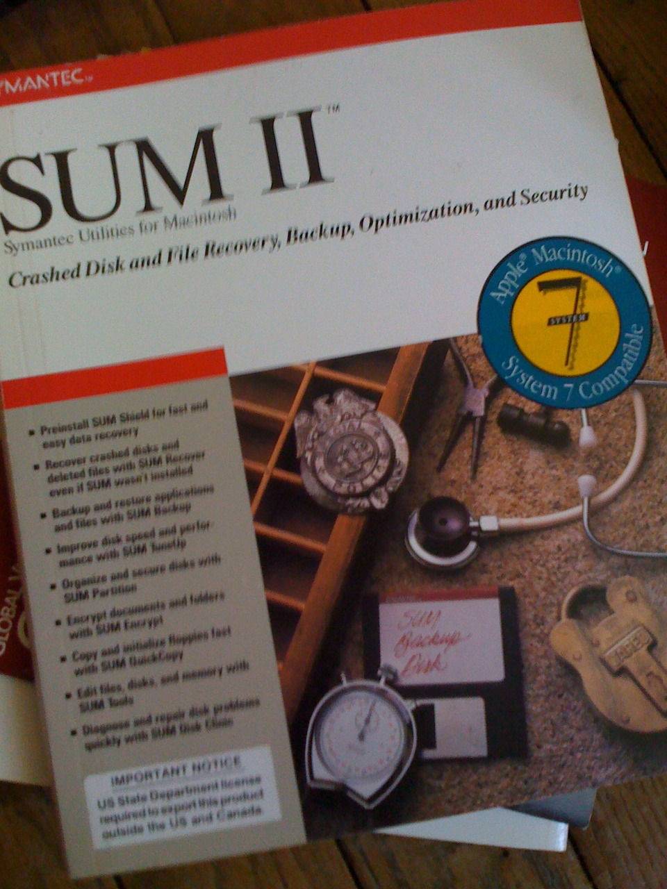
It sounded like a horrible idea at first.

Is it the nineties again? Aren’t we done yet with CD-ROM? “Interactive movies”? Someone’s seriously making art out of fucking pop-up windows? Come on, say it: multimedia is baaaaaaack!

Still, seriously, there’s a lot to like in this Arcade Fire clip/interactive movie by Chris Milk/Chrome Experiment/HTML5 Showcase. The deal is that it uses Google Earth and Google Street View imagery to “personalize” the clip, not through cheesy superimposition, but by creating and moving windows around, quite like split-screen techniques used in movies or in 24.

It’s an immersive experience – while it can run in the background and not disturb you, the point is that you’ll stay and watch – yet not as immersive as a true full screen show. For instance, you can still see part of your desktop – the Dock, the menu bar, a couple windows and icons hanging around. Because of that, it acts more like a a parasite than like a program. For instance, I’m having the whole show running again while I’m typing.

Another thing of note is that this whole post-modern-with-screens-everywhere experience has no center. There’s no master window staying in the middle of your screen running all the scripts and spawning the pop-up windows (well, technically there must be one, but none was really apparent). I like that; the spontaneity it simulates, your desktop come to life with birds and streets and windows and music.

Obviously it’s a novelty, a technology showcase and an elaborate marketing play (you can write a postcard at the end of the video, which might be distributed at shows for promotion). But it’s a good thing that that this kind of frills gets tried again and again, that people still try to explore every possible means of expression. HTML5, Flash, pop-up windows, apps, whatever. Technology’s irrelevant, what matters is the grammar within.

Visit link →


Système 7.5 — My favorite Mac OS Classic
More After Dark — Flying Toasters !
Marathon 2 & ∞
SUM — “System Utilities”
SimCity

The stuff you find when you move out of an old house.

Lire, écrire, traduire.

Prototype d’un espace de travail pour traducteurs.

> J’ai participé à une formation « Conception et Design Technologiques » avec Annie Gentès à Télécom ParisTech, au cours de laquelle les participants étaient invités à présenter un projet autour du thème « langues et cultures ». Voici ce que j’ai proposé.

J’avais plusieurs critères. Je préférais concevoir un logiciel plutôt qu’un service, afin de travailler l’interface plus en profondeur. Je voulais quelque chose qui me soit utile, au moins en partie – dans le temps imparti, n’ayant pas prévu de tests sur des tiers, je voulais pouvoir me fier à mes intuitions. Enfin, je voulais m’imposer des contraintes en rapport à mon travail sur la fenêtre.

J’ai retenu l’idée d’une application iPad pour traducteurs de textes littéraires, ce qui rentrait parfaitement dans le premier et le troisième critère – concevoir un logiciel avec de fortes contraintes, qui en l’occurrence étaient pas de fenêtres et une taille d’écran fixe. Pour ce qui est du second critère – créer quelque chose pour moi-même – c’est moins évident. Je ne suis pas traducteur. Mes seules expériences de traduction littéraire proviennent des cours de version en classes préparatoires. En plus de cela, j’habite avec quelqu’un qui a récemment traduit de la philosophie (l’annexe IV de ce livre), et j’ai pu observer de près ce travail. Mais plus profondément, ce projet est la continuation de mes réflexions sur l’iPad.1

Read more →

Jakob Nielsen – iPad Usability: First Findings From User Testing:

For more than a decade, when we ask users for their first impression of (desktop) websites, the most frequently-used word has been “ busy.” In contract, the first impression of many iPad apps is “ beautiful.” The change to a more soothing user experience is certainly welcome, especially for a device that may turn out to be more of a leisure computer than a business computer. Still, beauty shouldn’t come at the cost of being able to actually use the apps to derive real benefits from their features and content.

On the prevalent design style of 1st gen apps—lack of standardisation, save in the mistakes made by designers:

The first crop of iPad user apps revived memories of Web designs from 1993, when Mosaic first introduced the image map that made it possible for any part of any picture to become a UI element. As a result, graphic designers went wild: anything they could draw could be a UI, whether it made sense or not. It’s the same with iPad apps: anything you can show and touch can be a UI on this device. There are no standards and no expectations.

Content and interface merge, and this is both good and bad:

The iPad etched-screen aesthetic does look good. No visual distractions or nerdy buttons. The penalty for this beauty is the re-emergence of a usability problem we haven’t seen since the mid-1990s: Users don’t know where they can click.

Marco Arment:

Microsoft’s products from the last decade have felt like elaborate rides. Much of the operation of the OS is done via a large collection of wizards, with users (not customers) clicking Next, Next, Next so Microsoft can do whatever it wants or tells you that it needs to do. (Watch how non-geeks use their Windows computers. It’s sad.) It’s really Microsoft’s computer, not yours — you’re just the consumer along for the ride. Excuse me, the experience.

Visit link →

And let’s not confuse shyness with modesty or humility. Charles Darwin, who was very interested in shyness, correctly diagnosed it as a form of “self-attention” — a preoccupation with self. How do I fit in here? What do they think of me? It’s not always virtuous to sit on one’s personality and refuse to share it. (…) Nonetheless, there is much to celebrate in shyness. It has cunning, to begin with. Entering a room, it situates itself immediately in a hierarchy of social unease — this person is less shy than me, that person more so — and goes to work. And as a psychic state it is almost pure information: Talking to a very shy person, you feel yourself to be inside his or her electrical field, close-up in a way that the un-shy man, jawing on obliviously about his trip to Six Flags, would never permit. As for one’s own shyness, the shyness within, it is something to be endlessly tested and negotiated with. Should you attempt to hurdle it, and enter the situation full-bloodedly? Or is now the moment to heed its counsels and fall back? There’s an element of the existential in shyness. At the very least, if you’re shy, you’re never bored.

—James Parker — Shyness

J’ai préparé un cours à la main, sur du papier. (J’avais un nouveau crayon à essayer.) Maintenant, je suis hanté à l’idée de ne pas avoir de sauvegarde de ces trois feuilles, devenues plus précieuses que tout ce qui sort de mon clavier. J’étais moins trouillard auparavant.

One deficit an electronic reader has over printed media, and this is only a factor if you’ve been in the air as much as we have lately, is that there are portions of the flight where you can’t read. Your “book,” as it were, now belongs in the same criminal class of devices which includes laptops and missile transponders. The other deficit, I suppose, is that when the device runs out of power your “book” ceases to exist. It retains the gaudy and absurd physicality so common with objects, but all the purpose has leaked out. The unbook you have left becomes a lady of impenetrable chastity.

Penny Arcade - By Way Of Explanation

What we need now, I feel, is not another essay repeating No Silver Bullet for the 18,000th time. We need something that is more objective (based on measurable truth and falseness rather than just lists of anecdotes about successful projects and failed projects). We need something that reflects the best new ideas about what authorship means in 2010, not just electronic forms of 18th-century pamphlets. We need to stop rewriting the same things again and again (fail fast! NDAs are worthless! Execution matters, not ideas! Use the right tools for the job!). Instead we should start filling in the long tail of knowledge.

Puppy! - Joel on Software

Les soixante-six jours avant l’iPad

L'iPad a été annoncé le 27 janvier, et sera disponible aux États-Unis le 3 avril.1 Beaucoup de choses ont déjà été dites, bien que peu de gens aient eu l'occasion d'en tenir un entre les mains. C'est un nouveau dispositif, qui vient en complément ou en remplacement de l'ordinateur. C'est une interface directement issue de celle de l'iPhone, néanmoins porteuse d'un style nouveau, exigeant de nouvelles règles.2 C'est, à nouveau, un environnement qui se débarrasse des fenêtres.


Un journaliste tient un iPad

Photo de Jeff Carlson pour tidbits.


Pour juger l'iPad et son interface, on ne dispose que de quelques images et des déclarations d'Apple. Ce qui va suivre s'entend donc comme de l'analyse de discours. Jusqu'à la fin du mois de mars, l'iPad reste une un concept, une piste de réflexion sur l'avenir de l'informatique.3

Read more →

There wasn’t much time to make changes. Ballmer was emphatic not to redefine what was already done, even though McGregor had changed Windows from its original overlapping windows design to a tiled windows model and every windowing system out there or under development featured overlapping windows.

—Tandy Trower, le chef de projet de Windows 1.0 à 2.0 raconte l'aventure.

Dans le cadre des questionnements actuels sur la manière dont les individus se créent des « bulles » d’espaces privés dans l’espace public (le téléphone portable en est un exemple) le voile intégral en est l’expression ultime de sorte qu’il s’apparente davantage à une sorte de « lieu portatif » qu’à un vêtement, une manière de recréer un espace privé dans l’espace public.

—Frédéric Dejean — L'Islam en Europe : invisible, visible, trop visible ?